Choosing the Right Wall Color for Every Room
in Your Home

Between the sheer variety of shades available and the long-term commitment, it’s easy to feel overwhelmed when it comes to picking paint colors. Unlike decorative accents, which can be moved and exchanged with ease, wall color is a longer-term choice. The good news: we’re here to help.
Neutral, But Not Boring
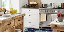
Neutral colors are some of the most versatile paint options available and for good reason. These colors can skew warm or cool, and they tend to pair beautifully with a wide range of colors. From trendy taupes to a classic, bright white, you’ve got plenty of options. Greys are popular hues that, as a neutral, can take on earthy, airy or dramatic tones depending on the intensity and shade.
If you’re considering a neutral tone, be aware that paint swatches are a good starting point, but the actual paint color may look completely different than it did in the paint store. Paint a couple of paint samples on the wall or tape the paper swatch up to see how it looks at different times of day.
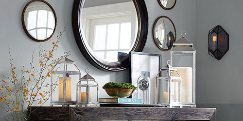
Find a Pattern
Do you have a favorite pattern in the room or a favorite piece of artwork? If so, choose one of the colors you like best from that piece and apply it to the wall. If you’re redoing the whole room, start by shopping for new pillows, rugs, window treatments or decorative accents. Pull your paint color inspiration from the piece that adds the largest pattern to the room. If you want to stick with neutral colors, look to the white and beige tones in the pattern.
Gauge the Mood
Whenever you decorate a room, you create ambience with the colors, patterns, textures and lighting that you choose. Think about the mood that you want to create in the room before you go shopping for paint. For example, soft colors and neutrals typically add a restful, soothing mood to a bedroom while dark, bold colors add drama. Warm and contrasting colors invite a socializing effect, while neutrals often add a formal feel. Match the color scheme to the mood you want to create for painting success.
Consider the Lighting
Lighting is a big factor for painters everywhere, and it’s one of the main reasons that professionals suggest testing the color with a swatch or sample before you start brushing or rolling it on the walls. Lots of natural light tends to show the color at its truest form, while fluorescent lighting tends to add blue tones and incandescent lighting enhancing yellow tones and warmth. For example, bright or strong colors can end up looking overpowering when you paint them on a wall near a bank of windows, but the same color could be gorgeous on an accent wall. Likewise, that white or beige that you painstakingly chose might end up looking yellow or blue, depending on the proximity of the nearest lamp. Always test the color out on each wall before getting started.
Follow the 60-30-10 Rule
Many designers rely on the 60-30-10 rule to choose their color scheme for a room. In this case, 60 percent of the room should be the dominant color, which means that your wall color should be the dominant color in the room. A secondary color should make up 30 percent of the room. Secondary colors typically come from your furniture upholstery. Accessories should bring in an accent color, representing only 10 percent of the room’s color scheme. This ratio produces a well-balanced palette that pulls everything together in an eye-pleasing way while still having a little pop of color.
Other Articles You May Be Interested In
There are lots of different ways to embrace an eco-friendly lifestyle in all parts of the house, and the kitchen is no exception.

To get any party started right - whether serving two or 50 - a great home bar should store evertything you need for working your drink-mixing magic.